Dashboards
Table of contents
Details
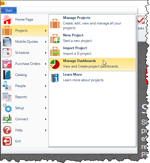
The Dashboards interface allows you to view data across multiple Projects. You can access this interface via Start->Projects->Manage Dashboards:
This opens the Dashboard Explorer:
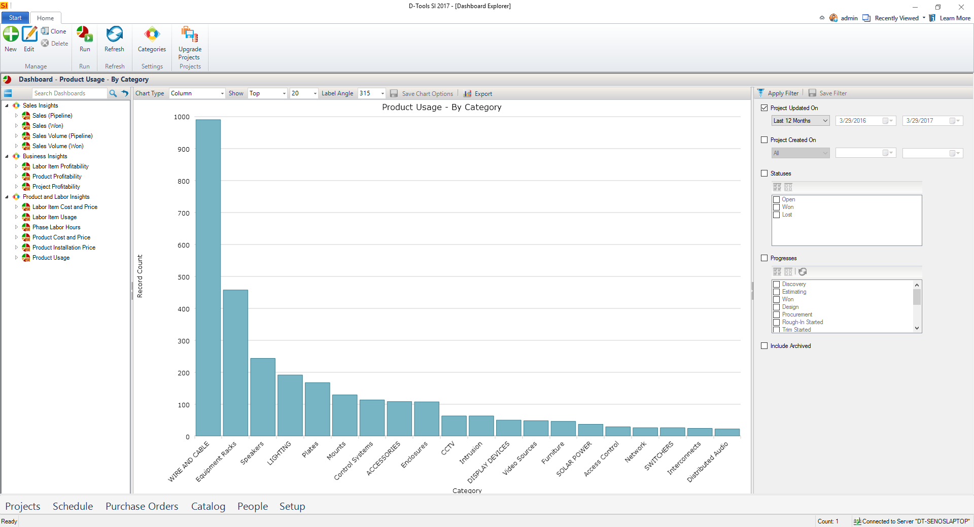
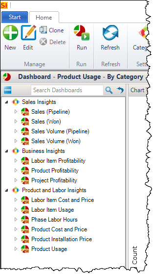
On the left side there is a list of the stock Dashboards in SI, organized by three Categories: Sales Insights, Business Insights, and Product and Labor Insights.
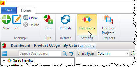
You can edit these Categories or create your own via the [Categories] button:
Each of the Dashboards can be expanded to display their Definitions (how they will group):
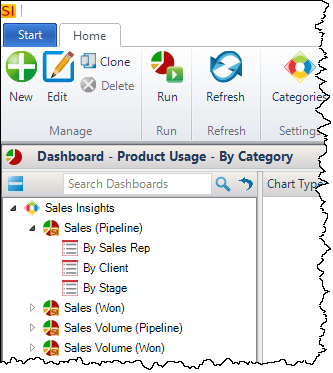
Note: "Sales Rep" refers to the "Assigned To" field for a Project and "By Stage" refers to the Project Progress field.
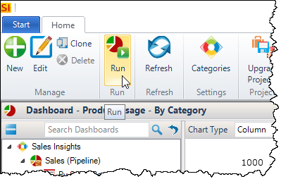
You can double-click a Definition to generate a Dashboard or you can select and click the [Run] button:
On the right side of the interface there are filters that you can apply:
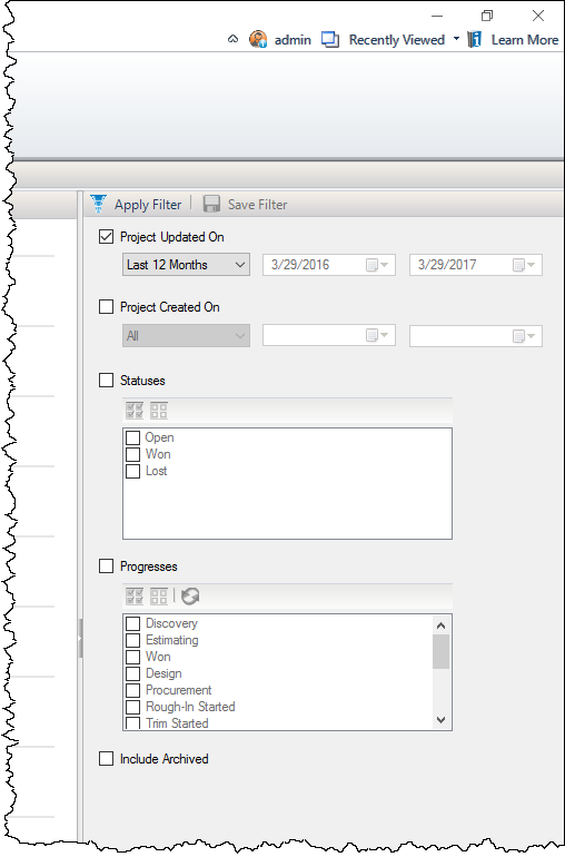
Project Progresses and the Statuses assigned to them dictate which Projects are used for the data for any given Dashboard.
When you run a Dashboard, you can then change the way the data is displayed via the buttons along the top of the interface. You can change the chart type to your preference: Column, Bar, Pie, or Table.
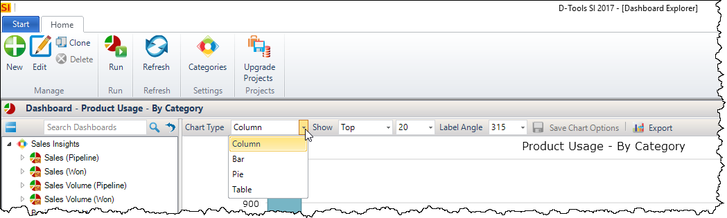
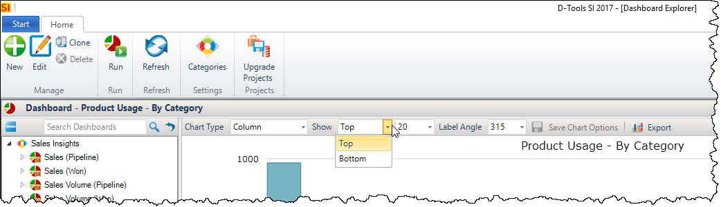
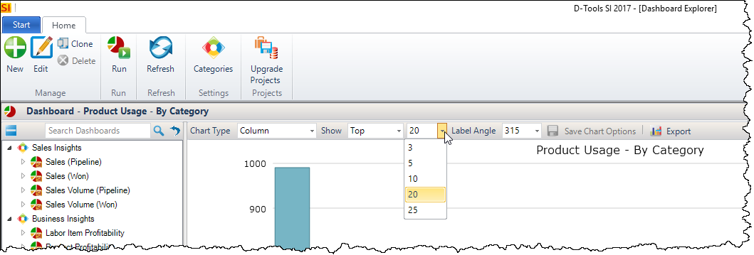
You can change whether to display the date from Top or Bottom and decide how many records to display:
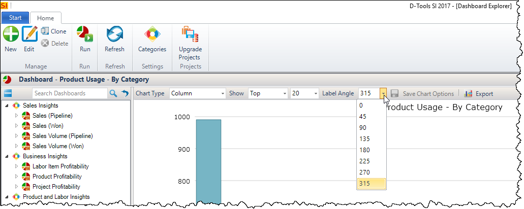
You can change the label angle:
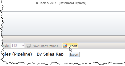
You can export the charts as a .png file or the Table can be exported to Excel or PDF:
Click here to learn how create your own Dashboards.
- © Copyright 2024 D-Tools